
During a course I am taking, a classmate, Stewart Cambridge, made an offhand remark: being an architect is really about knowing how the numbers play out. It stuck with me because it described something I had seen repeatedly, but had never articulated quite that way.
Ask a room of engineers what an architect does, and most answers will circle around the same words: patterns, principles, diagrams. Microservices or monolith. Event-driven or request-response. SOLID, hexagonal, MVC, CQRS. To some extent, architecture seems to sound like a matter of taste: if we apply enough experience, choose the right pattern for the occasion, then we only need to hope everyone agrees with the result (and the result works out as expected).
However, to me (and Stewart), that description misses the part that actually matters. The best architects I’ve worked with weren’t the ones who knew the most patterns. They were the ones who could look at a system, ask a lot of questions, and then tell you, with some precision, what would happen at ten times the load, with a fifth of the team, or after two years of uninterrupted data growth. Architecture is not a design discipline first. It is a discipline of investigation and forecasting that happens to produce designs.
A pattern is just a guess until it has numbers attached
Many architectural debates sound philosophical, but underneath them there is usually a more concrete question. “Should this be a service or a module in the monolith” is not only a question about elegance or adherence to some principles.
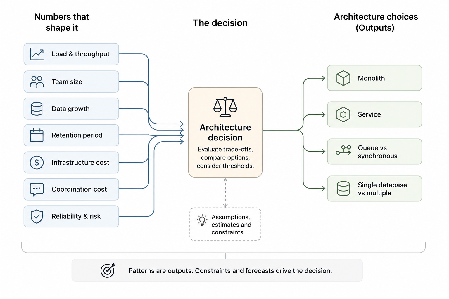
It’s a question about how many people will touch that code, how often it needs to deploy independently of everything else, and how much cross-team coordination the current structure is costing in hours per sprint. Answer those with real numbers, and the right architecture usually becomes much easier to see.
Once made, that decision also needs to become visible in the system itself, so that the architecture can guide the next decision rather than leave future engineers guessing.
The same is true for “should we use a queue here” or “does this need its own database.” These are design questions, but they really are estimation questions: what’s the write volume, what’s the acceptable staleness, what’s the cost of a lost message versus the cost of running another piece of infrastructure?
An architect who cannot attach at least a range, a threshold or an explicit constraint to those questions is not really making a decision. They’re expressing a personal preference and hoping it holds out in the future.
And the numbers are not only requests per second. They are people, deployments, incidents, hours of coordination, months of migration work, and ultimately money spent keeping the whole thing running.
The estimate is the deliverable, not the diagram
I’ve sat in enough design reviews to notice a pattern: the diagram is rarely where the disagreement lives. Everyone can agree on the boxes and arrows (especially the prettier and more neatly arranged they are).
Mind you, the diagram is still useful, but it is only a representation. The real deliverable is the reasoning behind it: the assumptions, the estimates, the trade-offs and the thresholds at which the decision stops making sense.
That’s because, when discussing a solution, the disagreement shows up when someone asks how it behaves under 50,000 requests a minute instead of 500, or whether we can increase the retention period from 30 days to a year.
At 50,000 requests a minute, we are dealing with roughly 830 requests a second. If each request produces 20 KB of data that needs to be retained, that is around 1.4 TB a day before replication, indexes, backups, or logs.
Then change the retention from 30 days to a year, and suddenly a seemingly harmless retention decision is shaping the database, the storage architecture, and, last but clearly not least, the cloud bill.
Those are the moments that actually change the design. Not because the diagram was wrong, but because nobody had done the arithmetic before drawing it.
This is why the most useful thing an architect produces in a design review is often not a picture. It’s a back-of-the-envelope calculation: expected throughput, expected data volume in a year, expected fan-out per request, expected cost per unit of usage. A design with a rough number attached to every assumption is far more defensible than a design with none, even if the second one looks cleaner on a whiteboard.
Being wrong about the numbers is the real failure mode
The systems I’ve seen fail in production almost never failed because someone picked the “wrong” pattern (because, in the abstract, no pattern is inherently wrong). They failed because someone’s estimate was off by an order of magnitude, and nobody caught it before it shipped.
A queue and its consumers designed for the launch-day spike, without anyone calculating how long the backlog would take to drain after the long-anticipated marketing campaign launches six months later. A reporting query that was harmless at one hundred thousand rows and brought production to its knees once the dataset reached a few hundred million. A service designed around a team of six that became a coordination nightmare when three teams inherited it without clear ownership boundaries.
None of those are pattern failures. They’re forecasting failures. The architecture was internally consistent and defensible on the day it was designed. It just wasn’t designed against the numbers that eventually showed up.
And when those assumptions remain implicit, more decisions start compounding on top of them long before anyone realises that the original forecast was wrong.
That’s also why experience matters more than familiarity with frameworks in this job. A senior architect isn’t senior because they’ve read more books on distributed systems. They’re senior because they’ve been wrong about a growth curve often enough to have a feel for where their estimates tend to be optimistic, and they include margins for exactly that.
And there’s something else experience has taught me: the estimate should not disappear after the design review. If a decision was based on an expected growth rate, forecast usage patterns, or cost per transaction, those numbers should be measured while the system is running. That gives us a way to reassess the original assumptions and determine whether the architecture still holds.
Numbers are also how you earn the room
There’s a practical side to this too. Stakeholders don’t remember whether you argued for hexagonal architecture or MVC, containerized software or serverless functions. They remember whether the system held up when usage tripled, and whether the migration you warned them about eighteen months ago actually became necessary on schedule.
Credibility as an architect is built less on the quality of your diagrams and more on whether the assumptions behind them roughly played out.
Say, “This will need to change once we cross a few million records”, and be right about it, and the next time you flag a concern, people listen without needing the full technical justification.
Say, “we should keep this flexible”, without ever attaching a number to when or why, and you’re just expressing a preference that competes with everyone else’s preferences.
Good architecture still needs the patterns, the principles, and the diagrams. They give us guidelines on how to think and a common vocabulary for discussing the result. Diagrams then make that reasoning visible. But none of them make the decision for us.
Patterns and principles are tools. Diagrams are representations. The difficult part is asking the questions that expose the real constraints, turning uncertain answers into useful ranges, and understanding what happens when those numbers begin to move.
That, more than knowing the name of the pattern, is what architecture looks like in practice, and, as Stewart put it so cleanly, being an architect is really about knowing how the numbers play out.